Introduction
The Dashboard provides an overview of your business performance with key metrics and visual charts to help you understand your business at a glance. You can customise the date range to analyse any period up to 12 months.Date Range Selection
The dashboard supports flexible date range selection with both quick presets and custom date picking.Quick Select Presets
Use the Quick select dropdown for common date ranges:- Today: View today’s data only
- Last 7 days: Recent week performance
- Last 30 days: Current month snapshot (default)
- This month: From the first of the current month to today
- Last 3 months: Quarterly view
- Last 6 months: Half-year analysis
- Last 12 months: Full year performance
Custom Date Range
For specific date ranges:- Click the date range picker button
- Select your start and end dates from the calendar
- Maximum range is 365 days
- Data refreshes automatically when you change the date range

Period Comparison
The dashboard supports period-over-period comparison. Use the Comparison toggle to select:- No comparison — Show current period values only (default)
- Previous period — Compare against the same number of days immediately before your selected range
- Same period last year — Compare against the equivalent dates one year ago
Overview Cards
The dashboard displays seven key metrics at the top, calculated for the selected date range:Total Revenue
- Shows the total revenue from all sales within the selected date range
- Includes revenue from appointments, products, and other sales
- Provides a clear view of overall business performance for the period
Active Clients
- Number of unique clients who had appointments in the selected date range
- Counts distinct clients from appointments within your chosen period
- Measures client engagement and activity for the specific timeframe
Bookings
- Total number of appointments within the selected date range
- Gives a snapshot of booking activity for the period
- Useful for comparing booking volumes across different time periods
Avg Sale Value
- Average revenue per appointment in the selected date range
- Total revenue from appointment-related sales divided by the number of appointments
- Helps understand the typical transaction value for the period
Client Retention
- Percentage of clients in the current period who also had appointments in a prior equivalent period
- Measures how well your business retains existing clients
- Higher retention rates indicate stronger client loyalty
No-Show Rate
- Percentage of appointments that were cancelled with a no-show reason
- Helps you identify no-show trends and take action (e.g., deposit requirements, reminders)
- A lower rate is better — the delta indicator inverts colour (green for decrease)
Online Booking Rate
- Percentage of appointments booked through your online booking page versus manually through the dashboard
- Helps you understand the adoption of your online booking system
- Higher rates mean less manual work for your team
Visual Charts
Service Distribution
Chart Type: Pie Chart What It Shows:- Top 5 services in the selected date range
- Each service shown as a slice of the pie
- Service names labelled in the legend below
- Helps identify your most popular services for the period
- See which services drive your business
- Identify services to promote
- Staff training priorities
- Compare service popularity across different time periods
Team Member Capacity
Chart Type: Bar Chart What It Shows:- Total bookings per team member in the selected date range
- Each team member shown as a bar
- Height represents number of appointments
- Names abbreviated to first 3 letters
- Balance workload across team
- Identify overbooked or underutilised staff
- Capacity planning for specific periods
- Fair distribution of appointments
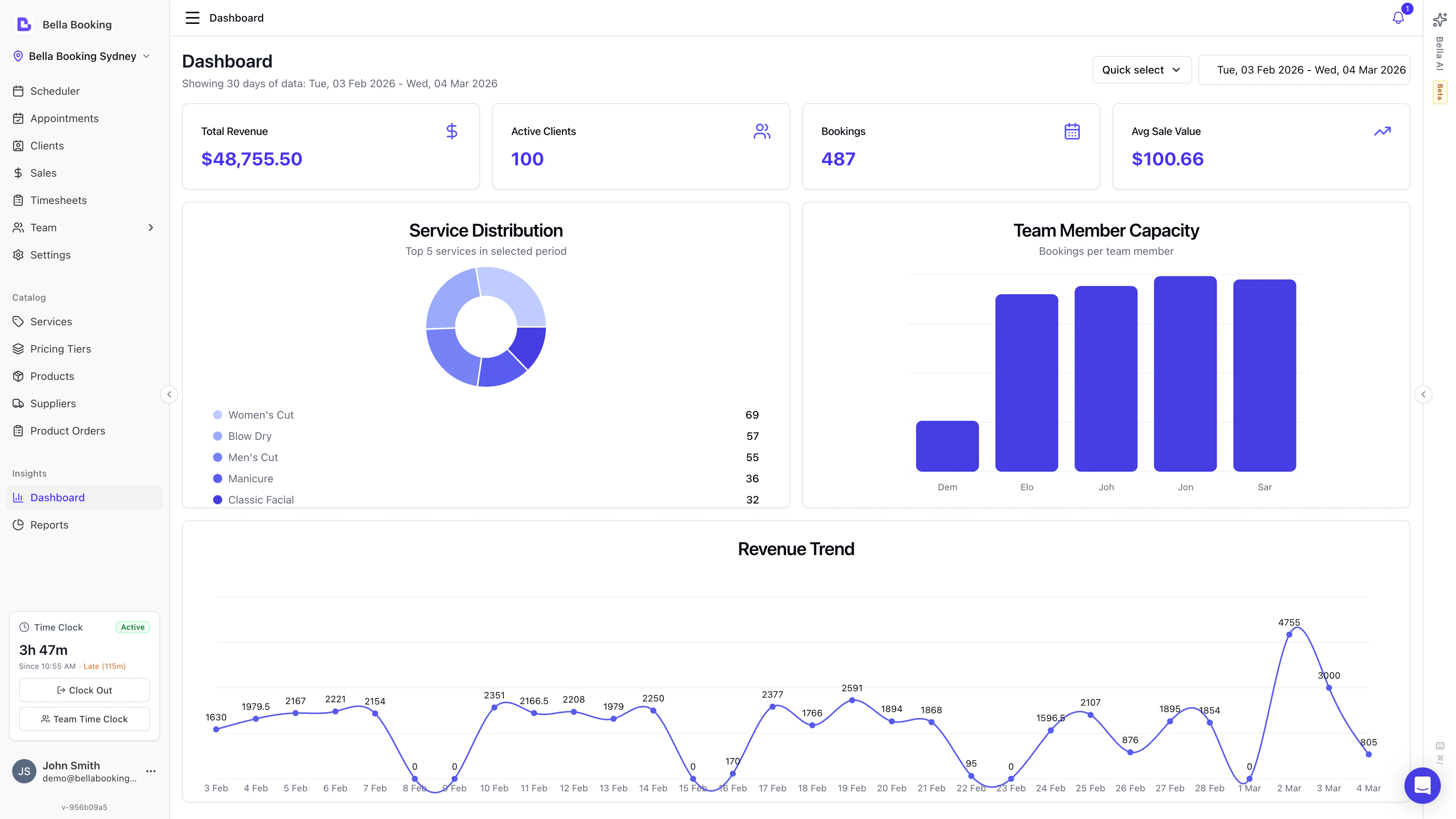
Revenue Trend
Chart Type: Line Chart What It Shows:- Revenue trend over the selected date range
- Automatically adjusts granularity based on date range:
- Daily Revenue: For ranges up to ~30 days
- Weekly Revenue: For ranges up to ~90 days
- Monthly Revenue: For longer ranges
- Data points with values labelled above each point
- Single-day selections do not show this chart (use a range of at least 2 days)
- Identify growth trends
- Spot seasonal patterns
- Compare performance across different periods
- Track business progress over time
- Set realistic revenue goals
Booking Source Breakdown
Chart Type: Pie Chart What It Shows:- Where your bookings come from — Online Booking, Business Dashboard, or System
- Percentage split between each source
- Helps you measure online booking adoption
New vs Returning Clients
Chart Type: Bar Chart What It Shows:- Breakdown of new clients versus returning clients for each period
- Helps you understand the balance between acquiring new clients and retaining existing ones
Revenue by Category
Chart Type: Pie Chart What It Shows:- Revenue split between services and products
- Helps you understand the balance of your revenue streams
Today Section
The dashboard includes a Today section at the top that shows a greeting with quick stats for the current day:- Appointments today — How many appointments are scheduled for today
- Revenue today — Revenue from completed appointments today
- Clients today — Number of unique clients being served today
Sparkline Trends
Each KPI card includes a sparkline — a small trend line showing the metric’s trajectory over the last 7 data points within the selected range. Sparklines give you an instant visual sense of whether a metric is trending up, down, or staying flat, without needing to open a detailed report.Your weekly review email (AI Business Digest)
The AI Business Digest — your weekly business review email — is an automated performance summary delivered to your inbox. Powered by AI, it analyses your business data and produces a personalised narrative covering your key metrics, trends, and actionable insights, so you get a read on how the week went without opening the dashboard. In the app and in your notification settings, it’s labelled Weekly business summary (the Summary email toggle).What the Digest Includes
- Performance snapshot — Revenue, bookings, active clients, and other key metrics for the week
- Period comparison — How this week compares to the previous week and the same week last year
- Highlights and concerns — AI-identified trends worth celebrating or addressing
- Actionable insights — Specific, data-backed suggestions tailored to your business
- Metric breakdowns — Cancellation rates, no-show rates, online booking rates, and rebooking rates (shown only when sample sizes are statistically meaningful)
How It Works
The digest is generated automatically each week for eligible accounts. It uses your appointment, sales, and client data to build a structured analysis, then an AI model writes a natural-language summary calibrated to your business’s maturity and volume.- New businesses receive encouraging, growth-focused language
- Established businesses receive detailed performance analysis with trend comparisons
- Mixed weeks are reported honestly — the digest doesn’t skew toward optimism or concern
Delivery
- The weekly review email is sent via email to account owners and administrators, and also appears in the in-app notification bell as Weekly business summary
- A monthly summary is available too, covering the calendar month
- Notification preferences — including which channels you receive it on — are configured in Settings > Notifications under the Business Summary event type (the Summary email toggle)
Viewing Past Digests
Past digests are accessible through the Bella AI assistant. Ask Bella AI “Show me my latest digest” or “What was in last week’s summary” to retrieve previous digests.Best Practices
Dashboard Review Routine
- Morning Check: Review today’s bookings and team capacity
- Mid-Month: Check if monthly revenue is on track
- Month-End: Analyse service distribution for trends
- Quarterly: Review revenue growth for multi-month patterns
Acting on Dashboard Insights
If Top Services Show Imbalance:- Train more staff on popular services
- Adjust pricing on underused services
- Market less popular services
- Adjust how appointments are assigned
- Cross-train staff to balance workload
- Consider schedules and availability
- Review recent changes (pricing, staff, services)
- Check appointment cancellation rates
- Consider promotional campaigns
FAQs
Q: How often is dashboard data updated? A: Dashboard data refreshes when you load the page or change the date range. Q: Can I change the date range for dashboard metrics? A: Yes! Use the Quick select dropdown for common presets (Today, Last 7/30 days, This month, Last 3/6/12 months) or click the date picker to select a custom date range. The maximum range is 365 days. Q: Why can’t I see the dashboard? A: Dashboard access is limited to Owners and Administrators. Check with your account owner if you need access. Q: Can I print or export the dashboard? A: Use your browser’s print function if needed. Q: What counts as an “active client”? A: Clients who have had appointments within the selected date range. Walk-in appointments without a linked client are excluded from client counts. Q: How is Client Retention calculated? A: The dashboard checks how many clients from the current period also had appointments in an equivalent prior period. For example, if you’re viewing the last 30 days, it checks if those clients also visited in the 30 days before that. Q: Can I compare performance across periods? A: Yes. Use the Comparison toggle to compare against the previous period or the same period last year. Delta indicators appear on each KPI card showing percentage change. Q: Why don’t I see the Revenue Trend chart? A: The Revenue Trend chart requires a date range of at least 2 days. If you’ve selected a single day (e.g., “Today”), the chart won’t display. Select a longer date range to view revenue trends. Q: How is the Revenue Trend chart granularity determined? A: The system automatically chooses the best granularity based on your date range:- Shorter ranges (up to ~30 days) show daily revenue
- Medium ranges (up to ~90 days) show weekly revenue
- Longer ranges show monthly revenue
Note: The dashboard provides a flexible snapshot of your business performance. For comprehensive analysis with additional filtering options, use the Reports section.